How a professional website helps law firms earn more money, attract clients and increase trust
---
Lawyers and partners of the law companies are aware that the key factors when choosing a company to work with are competence, prominence, reputation, past projects, and, certainly, its professionals
The personal brand of each particular lawyer is also substantial and formed by elements such as his office, appearance, behavior, and sometimes even a car. But if it were to invest time and money in a single object that would immediately have a significant impact on all performance of the firm, it would certainly be a professional website of a law firm.

By using the vast experience of the Smotrow Design studio and Jusnote, combining it with the knowledge of law companies that have already updated their websites, we will talk about why the creation of a website is a needed investment in the development of your brand.
How a client selects a law firm in 2021

The elements that a client assesses are not fundamentally changing. We mean, it’s impossible not to pay attention to the reputation of a firm. You can’t assess how a firm presents the information, and even each particular lawyer will be assessed.
But dramatically has changed WHERE a client assesses these elements. And the answer is obvious — on a website.
Today a law firm’s website is the main asset. Especially since 2020, when everything has switched to online mode. If a firm’s website is not good enough (or even really bad), it immediately tells a client that:
1. The law firm employs too few people to create and maintain the site;
2. The law firm does not earn enough money to create and maintain a good website. A message to the client: the firm has no clients. And thus, it indicates that the firm is not competent;
3. The law firm doesn’t work innovatively and cannot change in time, make quick decisions;
4. The law firm doesn’t monitor the current market and not striving to improve its processes;
5. The law firm doesn’t have enough cases to show. A message to the client: too few projects, distrust of firm, lack of competent personnel, and low level of professionalism;
6. The law firm has nothing to show, no team, no information;
7. The law firm operates behind closed doors and may have pitfalls;
However, a law firm that, back at the time, invested time and funds in developing a professional and well-considered website demonstrates to clients that:
8. The law firm can afford the best website. It means that the company makes enough money to work with the best design and technology professionals. And that means that the law firm has clients who pay for its services. A massive bonus to reputation;
9. The law firm cares about the experience of the clients when they are using their website and strives to provide information in a structured, qualitative and professional way;
10. The law firm values its brand and its global or national image;
11. The law firm makes it as simple as possible to get information about the company from anywhere in the world;
12. The law firm has extensive information and case studies to show to clients. It has successfully completed similar legal cases and can help the new client solve his problems. Indicates vast experience and history. History = trust;
13. The law firm follows trends and tries to optimize its processes, constantly develops, and thinks innovatively. It means that the firm applies the same approaches during the work on client assignments;
14. The law firm openly publishes information, has a professional image, and has nothing to hide;
15. The law firm has a team of professionals and shows it to clients. Their experience, skills, and previous achievements deserve to be shown. The team = trust;
We can continue this list. But the main point is that:

What must contain a professional law firm’s website?
Each firm is unique, and obviously, the structure of a website can vary. The unchanged remains the common goal of each of them — to present the brand on the highest level possible, show the competency, evoke the feeling of trust and tell a unique story. Based on our experience in creating websites for the best national and global firms, we recommend, when developing a website, to pay attention to the following:
16. The main page of a website is the first place where a client goes. From here, he then goes to other pages. So it must contain the primary information of the company, its specializations, and practices. We recommend also show the firm’s news so that the client can see that the information is relevant and the firm “lives”. You can also show the key specialists or the corporate video. The main goal is to quickly tell the client about the company, create a sense of professionalism, and direct the client further into the website. An example can be the website for Krolevetskyi and partners or Fama Prof Consult, both of them were created by Smotrow Design.

2. The right structure of the team page. The mistake of many firms is that they put a small number of diverse employees on the same page. We mean, here is the managing partner, here is the paralegal next to him, and here is the marketing guy. All it says is that the firm isn’t big enough and that there is no team. But the problem isn’t that the company is small. It is not about size at all. But the website should contain either only partners and nobody else, or all team members, but in this case — the team must have at least 10 people. You can’t choose something “in the middle”.
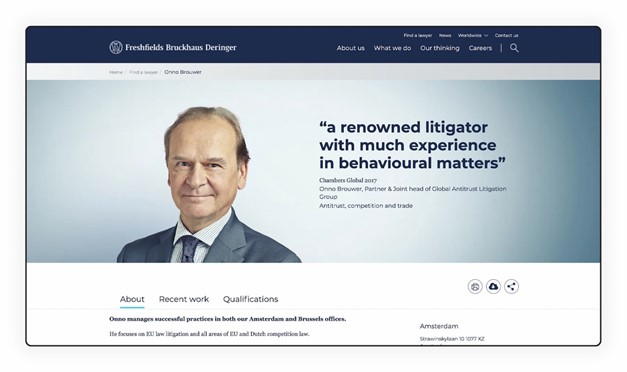
As for the information to show on the lawyer’s page, we recommend adding:
• Qualitative photo of the lawyer;
• Description of specialization;
• Past experience;
• Awards and achievements;
• Related news & legal cases;
• Contacts for communication (if the firm is large);
• Links to social media, mandatory on LinkedIn;
• CV, this file is still needed;
• You can add quotes;
You can take a look at the Freshfields Bruckhaus Deringer LLP website, we recommend you analyze it.
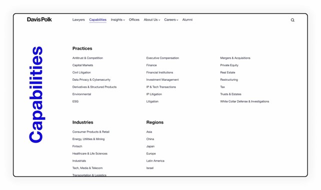
3. The website must have a separate page with a list of all practices and industries as well as a page with detailed information on each practice and industry. It can be done as a record or information material. On a separate practice page, you can place related publications and the key professionals so that the website won’t have deadlocks, and the client can always “browse further” and get acquainted with the firm.
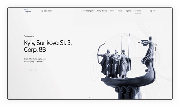
4. The contacts page must have a contact form, at least one office phone number, corporate email, and a map. We find it helpful and very convenient when firms add office photos. In addition, photos and a map show that the law firm is real, and it works. It evokes trust. If your firm doesn’t have photos, you can take an image of the city. If this principle also doesn’t work for you, the qualitative solutions can be graphics as implemented on the Asta-Capital website.
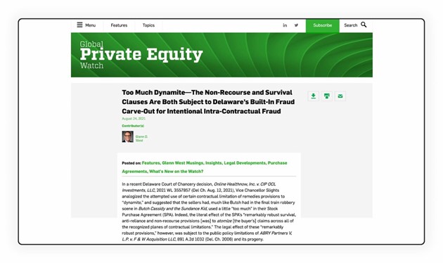
5. Many firms underestimate the importance of the “News” or “Press Center” page, but it plays a key role as an indication that the firm is functioning.
The first thing the client looks at when visiting a website is when was the last record created.
Therefore, it is crucial to put a section with the latest news directly on the website’s main page.
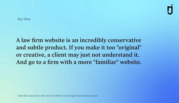
6. Creativity. We recommend you to think about creativity and “uniqueness” when all the basic tasks have been already completed. And you are sure that the client can do the main necessary actions without any problems and inconveniences.
Why a website is a powerful marketing tool for a law firm?
We will not repeat after everyone and say that Google ranks your website in a search output, clients will be able to find you, you will be visible on the Internet. It’s already clear to everyone. What we want to say is that the website is the beginning of sales. And how it looks, how expensive it is presented, how modern it is — all of it directly influences the final fee of the firm and yours as a professional.
You can’t make a template website for $100 and expect a client pays the firm $5,000. In most cases, such clients will simply not believe you and will not deal with the firm.
And vice versa, you will automatically raise the entrance threshold for customers who can pay for your services if you create a corresponding website. Other clients will simply be afraid to write to you. In other words, why bother going to the BMW motor show if you do not have money to buy these cars.
A website is a tool to showcasing the awards and achievements of a law firm
Showcasing the awards and achievements of a law firm will strengthen the brand’s credibility and authority. And will definitely influence the choice of a client. Therefore, when designing a website, it is always important to create a section of “Awards” and boldly show the expert level of the law firm in the selected industries. It is crucial for clients to see it because it psychologically confirms your status as an “expert” and makes the process of choosing a legal partner less frightening and risky. It is the first impression a potential client gets from your firm. The design, usability, and clarity of messages give your company control over people’s reactions.
15 law firm websites worth watching
These are the websites of law firms that deserve your attention. We recommend you explore and analyze them deeply. You will find dozens of new ideas to implement in your law firm.
4. Skadden, Arps, Slate, Meagher & Flom LLP and Affiliates
6. Davis Polk
9. Cleary Gottlieb Steen & Hamilton LLP
11. Wilson Sonsini Goodrich & Rosati
14. FSG Consult
15. Freshfields Bruckhaus Deringer
And remember that every day more and more competitors appear, and it is harder for clients to choose a firm with which they can build a lasting partnership. Use design and technology for a competitive advantage and open new horizons where others see barriers.
Related links
Main menu


